Shockbump: A Bold Script That Demands Attention
First Glance: Energy, Edge, and Unmistakable Attitude
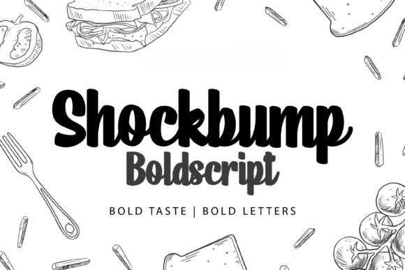
Opening Shockbump for the first time feels like flipping on a neon sign in a quiet studio — immediate, vivid, and impossible to ignore. This isn’t a gentle script. It’s a display font with kinetic energy: sharp terminals, aggressive swashes, tight letterfit, and a deliberate imbalance that reads as confident rather than chaotic. The lowercase ‘g’, ‘y’, and ‘f’ all extend with purposeful drama, while the uppercase letters carry weight without stiffness. Shockbump doesn’t whisper brand values — it declares them. It leans into modern typography with a punk-inflected polish, sitting somewhere between high-end editorial flair and streetwise authenticity. If your project needs personality with backbone — think indie beauty brands, limited-run apparel, artisanal food labels, or bold podcast identities — Shockbump arrives ready.
Where It Shines (and Where It Doesn’t)
Shockbump excels where impact outweighs exposition. In logo design, it works brilliantly as a primary mark for businesses that thrive on distinction: a boutique vinyl shop, a craft distillery, a feminist zine, or a design-led ceramics studio. Its rhythm and contrast lend themselves to clean lockups — especially when paired with a restrained sans serif for supporting text. For packaging design, it sings on front-facing labels, bottle neck tags, and box stamps. I’ve used it successfully on matte-finish soy ink prints and foil-stamped greeting cards — its strong shapes hold up beautifully under tactile treatments.
It performs strongly in social media graphics and digital ads where split-second recognition matters. A single-line quote in Shockbump over a muted background stops scrollers cold. Same goes for posters, event flyers, and invitation suites — particularly when you’re targeting audiences who value craftsmanship and visual wit. As a commercial font, it’s equally at home in Canva templates for creators and Cricut projects for small business owners building printable design assets or merch-ready files.
But be precise: Shockbump is not a workhorse. It’s not for body copy, navigation menus, or multi-paragraph blog posts. Its expressive nature sacrifices neutrality — and readability suffers fast below 24pt, especially in lowercase. Don’t force it into long headlines or stacked taglines. And avoid using it for functional UI elements or accessibility-critical text. It’s a premium font for moments of emphasis, not infrastructure.
Real-World Behavior Across Mediums
In web design, Shockbump works best as a headline font served via variable-weight web font files — but only after thorough testing across devices. On mobile, I limit it to hero sections or featured quotes, always with generous line height and ample contrast. In editorial design, I use it sparingly: section dividers, pull quotes, or masthead accents — never running text. For merchandise, it holds up well on screen-printed tees and embroidered patches, provided the design allows room for its swashes to breathe.
As a script font, Shockbump avoids the cutesy pitfalls of many handwritten fonts. It’s not “friendly” — it’s focused. That makes it ideal for brands that want sophistication without sterility. It builds audience trust through consistency of tone: when every touchpoint uses Shockbump with intention — a product label, an Instagram highlight icon, a thank-you card — it signals thoughtful brand identity, not decorative randomness.
Pairing Wisdom: Let Shockbump Lead, Not Compete
Font pairing isn’t optional with Shockbump — it’s essential. Its voice is too distinct to stand alone in most layouts. I default to crisp, neutral sans serifs (think Inter, Neue Haas Grotesk, or even a refined Helvetica Neue) for body text and captions. They ground Shockbump’s energy without dulling it. Occasionally, I’ll pair it with a warm serif font — like Adobe Garamond or PT Serif — for editorial depth, especially in print campaigns where texture matters. But avoid stacking it with other script fonts or decorative display fonts; that creates visual noise, not harmony.
Never assume spacing will behave intuitively. Kerning pairs like “To”, “Ve”, and “Wa” need manual adjustment in logo design. Test uppercase vs. lowercase usage early — Shockbump’s caps have more presence and tighter fit, making them stronger for monogram-style marks or short brand names. Its lowercase shines in expressive phrases (“hand-poured”, “made slow”, “unapologetically bold”) but loses clarity in longer strings.
Designer Notes You’ll Actually Use
- Test Shockbump in pure black on pure white first — no gradients or textures. See how its contrast and rhythm land without crutches.
- Print a mockup at actual size: a business card, product label, or social post. Screen rendering lies. Real paper reveals spacing quirks and legibility limits.
- Compare it beside at least three typefaces: a sturdy sans serif, a classic serif font, and a quieter script font. Note where Shockbump gains or loses authority in context.
- Check licensing carefully. Shockbump is a commercial font from Script Amp — confirm your license covers client deliverables, digital products, and resale items like Canva templates or printable planners before committing.
- Use it to reinforce hierarchy, not obscure it. One Shockbump headline per layout. One accent phrase per spread. Let silence do half the work.
The Bottom Line for Brand Builders
Shockbump isn’t for everyone — and that’s its strength. It’s a deliberate choice, not a decorative afterthought. When used with discipline, it elevates brand identity by adding unmistakable character without sacrificing professionalism. It tells viewers something real about the business behind it: that it values distinction, understands its audience, and refuses to blend in. For designers building for crafters, digital sellers, and small business owners who need standout creative font options — Shockbump delivers substance, not just style. Just remember: it’s a spotlight, not the whole stage. Use it to highlight what matters — and let everything else support, not compete.